“It really is different from what we have been doing, but at the same time there was this resounding ‘you know what? We need to really refresh and reframe ourselves around [the questions of] ‘What does it mean to be Christian, and what does it mean to be a university right now?’” These were the considerations surrounding Seattle Pacific
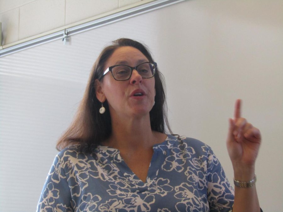
University’s rebranding according to Nate Mouttet, vice president of enrollment management and marketing for SPU.
This summer, Seattle Pacific’s students were shocked by the reveal of the university’s choice to change branding. Everything from the logo and the colors to the mission statements and slogans has undergone a total overhaul, and students reactions were certainly mixed.
However, Mouttet is confident in the work he and his team have done.
Contrary to popular belief, this decision was far from sudden; the marketing team have had this in the works for upwards of two years.
“The provost began a series of conversations two plus years ago, that I think we’re interestingly provocative and at the same time providential.” Mouttet remembers. “He was asking the question[s] ‘What does it mean to be a Christian university in Seattle, and what does it mean to be a Christian university at this time?’”
He explained that those conversations lead his team to inviting in impartial outside groups to advise and guide them toward the best solution.
“Most people felt that we clarified something that we already liked about SPU, but we just hadn’t said it that way. … Nothing [new] is something that makes you say ‘I have never heard SPU talk about our city that way before.’”
He understands that the most prominent question on students minds is in regard to why SPU chose to rebrand at all. What was wrong with our old branding? Why now? How did the decision come about to use the branding they chose?
“It’s almost like people are numb to [the old branding],” Mouttet stated.
“You could put up a bunch of billboards that are the same as every year before and people will be like ‘Eh, it’s there.’”
“I guarantee you that, this year, people are going to notice,” he continued, explaining why his team felt that now was the time for a change.
As far as the marketing choices, they go far beyond the scope of the new logo, which is the most visible, but not nearly the most deliberate choice made in this process.
Mouttet says that the marketing team wanted our institution and our values to be more recognizable at a glance. “Just from a simple marketing research, we found that people don’t quickly identify who we are just by a visual, or even by how we describe ourselves.”
Mouttet continued, “So we needed to take a posture that’s more committed to our faith and who we are, and if we don’t tie a visual to that, it may fall flat.”
The branding changes go much deeper than the shifted colors or the modernized logo.
According to Mouttet, the most important parts of the process were choosing our new slogans and mottos. He stated that, really, our branding is not much different than what SPU has always known.
“We wanted to develop a slogan that basically said, faith is taken seriously here, and it’s the kind of faith that projects us forward.”
“[We are] the version of Christianity that talks about compassion, and care for the poor, not belittling or that kind of caricature that people are seeing of Christianity right now, and I think that’s the piece that makes faith here so palpable, and so powerful.”
“Going forward, that’s what the world needs hope for.”
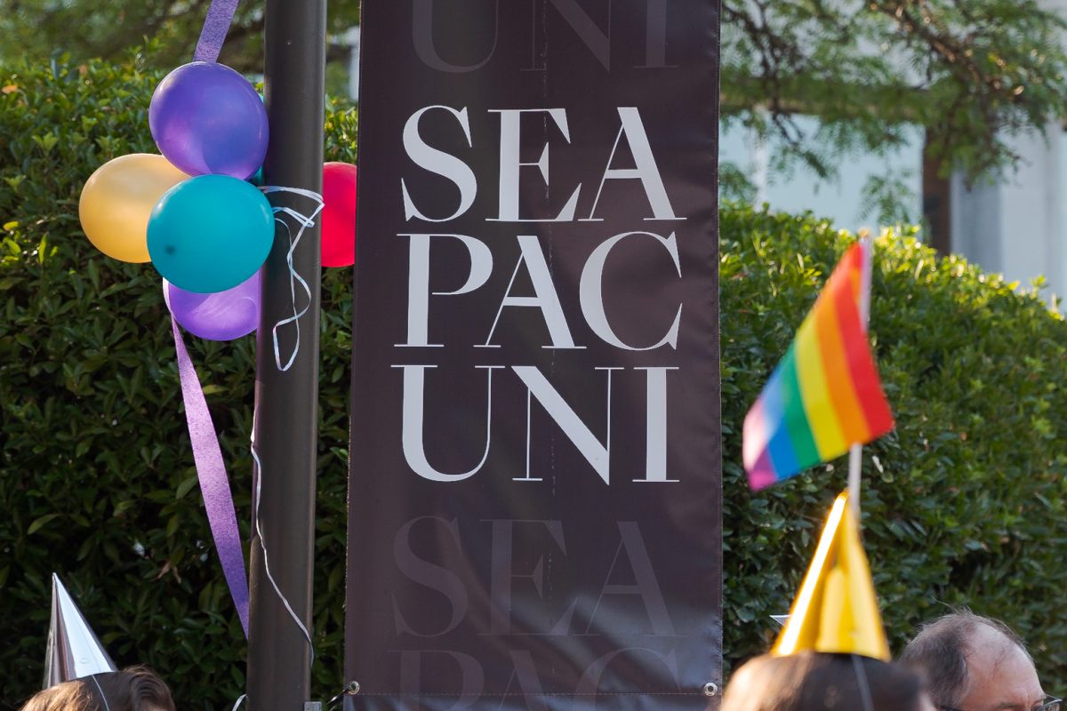
The slogans “Faith for the Future” and “Our City, Our Campus” have recently become the prominent phrases on our signs and billboards.
President Dan Martin made note of this change in his annual State of the University Address on Sept. 22.
“I have faith for the future because, those who are a part of this university are contributing daily to bad things decreasing and good things increasing.”
He explained throughout the speech the ways that “Faith for the Future” fits into our campus, and how he holds out hope for an even brighter tomorrow at SPU.
“May we foster faith for the future,” Martin said at the conclusion of his address, “ by encouraging our students to not only rise to opportunity, but rise to challenge.”
This was exactly the supportive response that Mouttet had hoped for before the release of the rebrand, and largely the response he reports to have received.
Despite faculty and alumni satisfaction, some students are worried that the rebrand will affect their tuition.
Mouttet wants very much to silence that concern. He says that no, the tuition has not and is not planning to be raised due to the rebrand.
In fact, Mouttet insists that the tuition conversation is a common one amongst SPU leadership, as they try to figure out the best way to price tuition so that students can find it possible to come here.
According to Mouttet, they are concerned with the same things that we are, affordability and accessibility for an education at SPU.
“That is actually a very active conversation to figure that out, but it is not one that, like, today says at this moment we’re doing something different with tuition. But it is on the cusp of being the kind of decision that comes before, potentially before the board in the coming year,” Mouttet said.
““We are trying to absorb what happens already.
We print new programs every year for the Convocation, it didn’t take new money to print new programs with the new logo on it,” Mouttet explained.
“So, every time we do something during the course of the year, we are trying to absorb [that cost] into the budget we would already use.”
Ultimately, the marketing team is excited about the new branding and the ways that it affects our campus.
It is Mouttet’s hope and belief that SPU students could confidently say they found somewhere that matches their values.
“I want students to be deeply empowered by ‘We take this so seriously here, we want to be great advocates for ourselves and we want to scream from the rooftops.’”

